
A strong visual background does more than fill empty space it sets the tone for how people perceive your work. Whether you’re publishing a blog post, sharing a portfolio piece, or promoting a product, the background quietly communicates professionalism, clarity, and intent. On a site like ameisenhardt.com, where credibility and thoughtful presentation matter, background choices can either elevate the message or quietly undermine it.
Think about the last time you landed on a website that felt instantly trustworthy. Chances are, the design felt balanced. The text was readable. The visuals didn’t compete for attention. That harmony often comes down to something deceptively simple: the background.
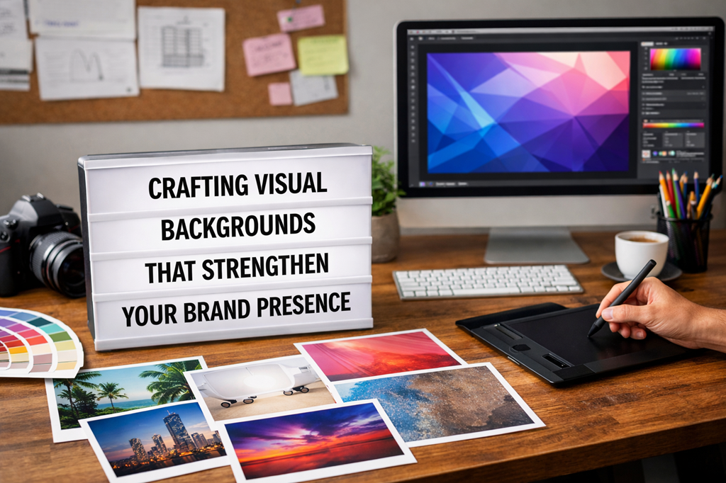
Why Backgrounds Matter More Than You Think
For creators, consultants, designers, and entrepreneurs, backgrounds play a functional role. They guide the eye, support the content, and reinforce brand identity. A clean, intentional background can make written ideas feel sharper and images feel more polished.
In practical terms, this is where tools like a background maker become incredibly useful. They allow you to quickly create, refine, or replace backgrounds without needing advanced design skills. Instead of wrestling with complex software or settling for generic visuals, you can shape backgrounds that actually fit your message and audience.
The real advantage isn’t speed alone it’s consistency. When your blog images, social graphics, and featured visuals share a cohesive background style, your brand becomes more recognizable and more memorable.
Backgrounds as Part of Brand Storytelling
Every brand tells a story, even when it doesn’t mean to. Backgrounds are part of that narrative. A muted, minimal background suggests focus and expertise. A textured or colorful one can signal creativity and openness. The key is alignment.
For example, if ameisenhardt.com is positioning itself as thoughtful, strategic, and refined, loud or cluttered backgrounds would feel out of place. On the other hand, subtle gradients, soft neutrals, or carefully chosen imagery can reinforce that positioning without a single word being spoken.
A useful exercise is to ask: What do I want someone to feel before they even start reading? Calm? Curious? Confident? Your background choices should support that emotional cue.
Real-Life Use Cases That Actually Matter
Let’s move away from theory for a moment.
Imagine you’re publishing a long-form article. A busy background image behind the header might look interesting at first, but if it reduces readability, readers won’t stick around. Swapping it for a simplified, lightly textured background keeps attention on the content where it belongs.
Or consider a consultant sharing case studies. Clean backgrounds behind charts and visuals instantly make the data feel more credible. Clients don’t consciously think, “This background is well-designed,” but they do feel that the work is professional and trustworthy.
Even something as simple as a newsletter graphic benefits from thoughtful background design. Consistent backgrounds across emails create familiarity, which increases open rates and engagement over time.
Practical Tips for Better Background Design
You don’t need to be a designer to make smart background decisions. A few guiding principles go a long way:
1. Prioritize readability first
Text should always be easy to read. If the background competes with the words, simplify it. Slight blurs, overlays, or solid colors often outperform detailed images.
2. Limit your palette
Choose two or three background colors that align with your brand and stick to them. Consistency builds recognition faster than variety.
3. Use contrast intentionally
Light text on dark backgrounds or dark text on light backgrounds avoid middle-ground tones that strain the eyes.
4. Think modular
Create background styles that can be reused across blog headers, social posts, and presentation slides. This saves time and keeps everything visually aligned.
5. Test on different devices
A background that looks great on desktop might overwhelm on mobile. Always preview before publishing.
Backgrounds and SEO: The Quiet Connection
While backgrounds don’t directly affect search rankings, they influence user behavior and that matters. Clean, readable design improves time on page, reduces bounce rates, and encourages deeper exploration of your site.
Search engines notice when users stay longer, scroll further, and interact more. Backgrounds that support clarity and usability indirectly contribute to better performance by making your content easier and more enjoyable to consume.
In other words, good background design doesn’t just look nice it supports the business goals behind your content.
Avoiding Common Background Mistakes
Even experienced creators fall into a few predictable traps:
- Over-designing: More effects don’t equal more impact. Often, the simplest background performs best.
- Chasing trends: What looks fashionable today can feel dated quickly. Timeless backgrounds age better.
- Ignoring accessibility: Low contrast or overly decorative backgrounds can alienate readers with visual impairments.
Being intentional not flashy is usually the winning move.
Building a Visual System, Not Just a Single Image
The most effective websites don’t rely on one perfect background. They use a system: a small set of background styles that work together across pages and formats. This approach makes content creation faster and keeps the brand experience cohesive.
For ameisenhardt.com, that might mean one background style for long-form writing, another for featured images, and a third for promotional content all visually related, but each serving a specific purpose.
Once that system is in place, every new piece of content feels like part of the same conversation.
Final Thoughts
Backgrounds are easy to overlook because they’re meant to stay in the background. But when they’re done right, they quietly amplify everything else your words, your ideas, and your brand credibility.
By treating background design as a strategic choice rather than an afterthought, you create a smoother, more professional experience for your audience. And over time, those small visual decisions add up to something powerful: trust.
When your content feels clear, intentional, and cohesive, readers don’t just consume it they remember it.