
Introduction: Where It All Begins
Every piece of poster art tells a story—one that goes beyond colors, shapes, and typography. For me, creating poster art is not just about visual appeal; it’s about capturing emotions, ideas, and moments in a way that resonates with people. This journey is deeply personal, shaped by experiences, influences, and a constant desire to experiment and grow as an artist.
Finding Inspiration in Everyday Life
Inspiration doesn’t always strike in dramatic ways. Often, it emerges from everyday moments—street signs, vintage advertisements, music, architecture, or even conversations. Artists like Adam Turman have shown how local culture and personal perspective can transform ordinary subjects into compelling visual narratives. That idea has always stayed with me: art doesn’t need to be complex to be powerful; it just needs to be authentic.
I often carry a notebook or use my phone to capture ideas as they come. These fragments—colors I notice, textures I admire, or phrases I hear—eventually become the foundation of my poster designs. Inspiration is less about waiting and more about observing.
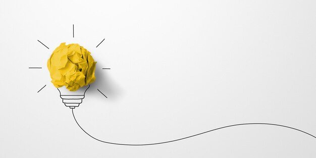
Concept Development: Turning Ideas into Direction
Once an idea sticks, the next step is shaping it into a clear concept. This stage involves asking questions:
- What message do I want to communicate?
- Who is the audience?
- What emotion should the poster evoke?
I usually start by creating rough sketches—nothing polished, just quick outlines to visualize composition and layout. This phase is crucial because it sets the tone for the entire project. A strong concept acts as a guiding light, ensuring that every design choice aligns with the core idea.
Mood boards also play a big role here. By collecting references—colors, fonts, images—I create a visual direction that helps maintain consistency throughout the process.
The Design Process: From Sketch to Digital
After finalizing the concept, I move into the digital design phase. This is where creativity meets technical execution. Using design software, I refine my sketches and begin building the poster step by step.
Typography
Typography is often the backbone of my poster art. Whether bold and modern or subtle and vintage, the choice of font can completely change the tone of a design. I experiment with spacing, alignment, and hierarchy to ensure the text complements the visuals.
Color Palette
Colors are chosen carefully to evoke specific emotions. Bright, contrasting colors can create energy and excitement, while muted tones offer a more nostalgic or calm feel. I usually limit my palette to maintain focus and avoid overwhelming the viewer.
Composition
Balancing elements within the design is key. I pay close attention to spacing, alignment, and visual flow to guide the viewer’s eye naturally across the poster. Negative space is just as important as the elements themselves—it gives the design room to breathe.
Experimentation and Iteration
No great poster is created in a single attempt. Iteration is a huge part of my creative journey. I often create multiple versions of the same design, tweaking colors, adjusting layouts, or trying completely different approaches.
Sometimes, stepping away from the work helps. Returning with fresh eyes allows me to spot issues I might have missed earlier. Feedback from peers or clients is also invaluable—it offers new perspectives and helps refine the final piece.
Challenges Along the Way
Every creative process comes with its own set of challenges. One of the biggest hurdles is overcoming creative blocks. There are times when ideas simply don’t flow, and the design feels forced.
During such moments, I try to shift my focus—explore new styles, revisit old work, or even take a break. Creativity isn’t linear, and accepting that helps reduce pressure.
Another challenge is balancing originality with trends. While it’s important to stay relevant, I always strive to maintain a unique voice in my work. Trends may come and go, but authenticity creates lasting impact.
Bringing the Poster to Life
Once the design is finalized, the next step is production. Seeing a digital design transform into a physical poster is incredibly satisfying. The choice of paper, printing technique, and finish all contribute to the final outcome.
Screen printing, in particular, adds a tactile quality that digital prints often lack. The texture, depth, and slight imperfections make each piece feel more personal and handcrafted.
Lessons Learned from My Creative Journey
Over time, I’ve learned that the journey is just as important as the final result. Each project teaches something new—whether it’s a design technique, a better workflow, or a deeper understanding of storytelling. This growth also helped me appreciate the value of professional Screen Printing Services Minnesota in bringing creative ideas to life with precision and quality.
Consistency and patience are key. Not every design will be perfect, and that’s okay. What matters is the willingness to keep creating, learning, and evolving.
I’ve also realized the importance of staying true to my vision. While feedback is valuable, it’s essential to maintain a sense of identity in your work. That’s what makes your art stand out.
Conclusion: More Than Just a Poster
Poster art is more than a visual medium—it’s a form of expression that connects ideas with people. From the initial spark of inspiration to the final printed piece, every step of the process contributes to the story behind the artwork.
As I continue this creative journey, I aim to push boundaries, explore new techniques, and tell stories that resonate on a deeper level. Because at the end of the day, great design isn’t just seen—it’s felt.
If you’re looking to transform creative ideas into high-quality prints, exploring professional screen printing services minnesota